How I Built My Minimal Blog Website
Creating a blog from scratch isn’t just about putting up posts — it’s about building a space that feels like you. One that’s easy to maintain, fast to load, SEO-friendly, and aesthetic enough that you’re proud to share it.
This is a detailed breakdown of how I built my own personal blog, from a blank screen to a deployed site — and every hurdle I crossed along the way.
The Vision
I didn’t want to just clone an existing blog. I had some goals in mind:
- Minimal dark theme with some green and reddish accents
- Fast performance and easy deployment (no server headaches)
- Ability to preview nicely on Twitter, Telegram, LinkedIn
- Ability to upload static files like certificates, PDFs, etc.
- A clean 404 error page for broken links
The Tech Stack
Here’s what I chose:
| Tech | Why I Picked It |
|---|---|
| Hugo | Fast, flexible static site generator |
| Netlify | Free & reliable static hosting + HTTPS |
| GitHub | Version control, and easy CI/CD integration |
| Markdown | Clean content writing & editing |
| Custom theme | I didn’t want to use unedited templates |
Step-by-Step Build Process
1. Initialize the Hugo Project
hugo new site ansonblogs
2. Theme Selection & Setup
I started with the Archie theme by @athul — a clean, minimal Hugo base — and heavily modified it to match my own vision.
layouts/_default/baseof.htmllayouts/partials/head.htmllayouts/partials/header.htmllayouts/partials/footer.html
This allowed me to control:
- Dynamic page titles (like “Anson Jaison | Blog”)
- Meta tags for SEO and social sharing
- Custom favicons
3. Open Graph & Twitter Cards
One of my goals was that when shared on Twitter or Telegram, posts should show a large preview.
To do this:
- I set the
twitter:cardmeta tag tosummary_large_image - Used
.Params.coverfrom the post’s front matter to generate preview images - Added fallback to
Site.Params.og_imageif no cover was set - Validated using OpenGraph.xyz
Issue faced:
Despite correct tags, Twitter sometimes still shows a small card due to cache or crawl delays.
4. 404 Page Setup
By default, Netlify displays its own 404 error page. I wanted something custom but matching my theme.
So I added a full layout code that:
- Inherits my site’s header/footer
- Displays a centered message
- Offers a “Back to Home” button
This ensures broken links don’t feel abandoned.
5. Certificate Uploads
I wanted to host documents like my certificates in a shareable way. So I created:
mkdir static/certificates
Then uploaded my files. Any file inside static/ is directly accessible.
Example:
https://ansonblogs.netlify.app/certificates/filename.pdf
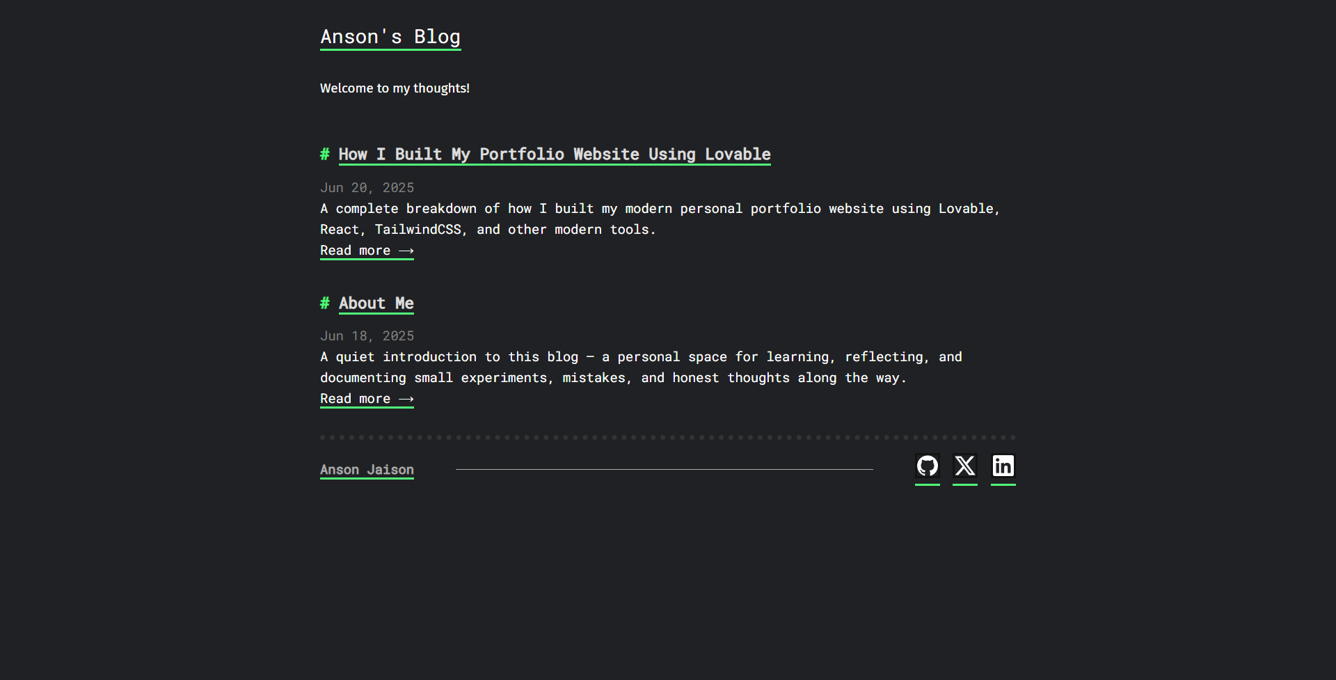
6. Footer Customization
Initially, the Hugo theme footer showed default Hugo branding and links like “Built with Hugo”, but that didn’t really reflect me.
So, I made a few edits:
- Left side: I added my name, hyperlinked to my portfolio website.
- Right side: I added my GitHub, LinkedIn, and Twitter (X) links with corresponding icons.
Now it feels personal, minimal, and professional — and gives visitors a full-circle view of who I am.
7. Google Search Console + Analytics Setup
Tracking how people discover and interact with my blog was something I didn’t want to skip.
So, I integrated two essentials:
- Google Search Console: Helps me understand how my blog appears in Google search, what keywords trigger impressions, and if there are any crawl or indexing issues.
- Google Analytics: Gives me real-time insights into traffic, popular posts, user behavior, and more.
I verified my domain using the meta tag method in Hugo’s header.html, and added my Google Analytics tracking code in the same spot.
Now I have a clean dashboard to track growth, fix issues early, and learn what content resonates best.
8. My Blog Writing Workflow
To be honest, I would’ve preferred using a proper CMS with a neat dashboard to create and manage posts. But most of those setups required additional configuration, backend hooks, or features outside the free tier — especially when self-hosting.
So for now, I kept it minimal and stuck to the basics:
command line + VS Code + Markdown.
Here’s my flow for writing new posts:
- I start with Hugo’s CLI:
hugo new posts/my-new-post.md
- That gives me a clean Markdown file with some front matter (
title,date,tags, etc.) - I write the content using Markdown:
- Add headings, lists, and code blocks
- Drop in
cover:images if needed - Creates folder in /static/uploads for each blog to keep it media
Once the post is ready:
git add .
git commit -m "New blog post"
git push
- Netlify picks up the changes and auto-deploys within seconds
It’s simple, fast, and distraction-free. When I buy a domain and upgrade later, I’ll definitely explore adding a proper CMS or admin panel to streamline it even more.
Problems I Faced & Solved
Twitter Preview Not Showing Large Image
Despite meta tags being correctly configured, Twitter sometimes refused to update previews.
Fix: Waited for Twitter’s cache to clear or used https://cards-dev.twitter.com/validator to refresh.
White 404 Page
The custom 404 page initially showed a white background due to missing layout inheritance.
Fix: I wrapped the content inside the site’s default layout and applied main.css.
SEO, Sitemaps & Meta
- A sitemap was auto-generated by Hugo
- Robots.txt included
- Canonical links were set in the
<head> - OG/Twitter/meta tag hierarchy followed best practices
- Validated using:
- Google Search Console
- OpenGraph.xyz
- Twitter Card Validator
The Most Unexpected Challenge
The biggest challenge wasn’t technical.
I was deep into building the blog. Things were going great. Everything was coming together — the design, the content, the structure. It felt almost done.
Then, while I was trying a small change, something unexpected happened — I accidentally deleted the root folder of my Hugo project. The folder that had all the Markdown content, theme files, config settings — everything I had written and customized from scratch.
Gone. Instantly.
And to make it worse, I hadn’t committed those files to Git yet. Only the generated public folder was being pushed.
For a moment, I just sat there in disbelief.
Honestly, I felt like crying.
I was talking to Elvi about it. I remember recording the voice note — trying to sound okay, failing halfway through. She heard every pause I couldn’t hide. Her reply? It was simple, honest, and exactly what I needed:
“I know how valuable this is for you. It’s a big achievement.
But that was your first version — it taught you how to build.
Now let’s build the next one together.
You can teach me everything you did, and I’ll build one too.
We’ll make it better — together.”
Rebuilding From Memory (and a 700-Page Chat)
Back then, my basic building assistant was ChatGPT — like always.
All of my planning, questions, code tweaks, theme edits — it was all part of a single chat thread. So I exported the entire thing into a PDF, and it turned out to be almost 700 pages long. I carefully went through it, page by page. Fortunately, I had shared parts of the updated code back to ChatGPT while building — so I could recover pieces from there.
Then, bit by bit, I started remembering:
What files I had edited. What changes I had made. How the folder structure looked.
And what I had done to make it all feel complete.
It wasn’t easy. But slowly, I recreated everything. From scratch. The layouts, the theme overrides, the posts, the SEO, the favicons, the image folders. All of it.
And this time, I wasn’t doing it alone. I was building it with someone who believed in me.
What came out of that experience wasn’t just a “recovered” blog. It was a better version — with better clarity, more intention, and a story behind every file.
Like Elvi said, sometimes the real version starts only after the first one breaks.
Bonus Touches That Made It Mine
After rebuilding everything from scratch, I added a few little touches — not huge features, but details that made the blog feel more polished, more intentional. Like something I’d truly crafted.
Scroll Progress Bar + Footer Home Icon
I wanted a subtle way to indicate reading progress across long articles — something that felt like a part of the UI rather than a separate feature. So I added a scroll progress bar that grows from left to right as you read the post.
It’s a tiny 4px green line that sits quietly at the top of the page. While you’re immersed in the content, it simply tracks how far you’ve reached — no distractions, just clarity.
Then there was another small improvement I felt was worth adding:
At the very bottom of the article, once you reach the footer, a tiny home icon appears — centered, minimal, and responsive. It lets you jump straight back to the homepage with one tap — especially useful on mobile.
These aren’t groundbreaking features. But they make the reading experience feel just a bit more complete. And that’s exactly what I wanted this blog to be.
Custom Quote Styling for Standout Moments
Quotes — whether they’re personal, reflective, or simply informative — deserved more than the default blockquote styling.
So I created a custom quote block.
It’s designed to stand out just enough to guide the reader’s attention, while still feeling native to the site’s overall design.
Key features:
- Clean monospace italic typography
- A subtle dark green background with a soft glow
- Rounded corners, generous padding, and a matching green border
- Fully responsive and accessible in dark mode
Now, anytime I include a quote — whether it’s a thought, a reply, or a sentence I want to highlight — it flows with the post naturally while still catching the eye. It’s a small addition, but it adds rhythm and emphasis to the reading experience.
Social Sharing (A Little Late, But Just in Time)
This was something I forgot to add during the first build — it just slipped past. Only after everything else was done did I realize:
maybe I should let people share these posts easily too. So I added a small share box at the bottom of each article.
No extra text. Just icons.
Subtle animation. Straight green underline.
And all the usual platforms — X, LinkedIn, Telegram, WhatsApp, Reddit, Facebook.
And now, if someone wants to pass something along, it’s right there — without getting in the way.
Final Outcome
My blog is now:
- Fully deployed at ansonblogs.netlify.app
- Shows clean metadata when shared
- Supports document sharing and preview
- Fast to load and easy to update via GitHub
Final Thoughts
If you’re trying to build your own blog, I highly recommend using Hugo + Netlify. You get:
- Speed
- Control
- Flexibility
…but you also learn how real websites work: from DNS to deployment, theming to metadata.
This whole journey has not only helped me publish my writing — it has made me a better developer and designer too.
Thanks for reading. You can check out the source code on GitHub or my portfolio for more projects!